Define typography?
The art of expressing ideas through the selection of appropriate typefaces
Where did the word "typography" originate from?
The Greek words for "form" and "writing"
What does typography involve?
The selection of the appropriate fonts, sizes, line spacing, spacing between the letters
What is a typeface?
A distinctive design of visual symbols that are used to compose a printed image/design.
What is another term for typeface?
Fonts
What is a character?
An individual symbol that makes up a typeface
What is type style?
Modifications in a typeface that create design variety while maintaining the visual style of the typeface; bold, italic, condensed, roman, heavy
What does type style "create" within a design?
Variety
What is the waist line and what does it indicate?
An imaginary line drawn at the middle of the characters
What is a base line and what does it indicate?
An imaginary line at the bottom of the characters, where everything sits
What is an ascender?
The park of the character that extends above the waist line
What is a descender?
The part of the character that extends below the base line
Describe a serif?
A smaller line used to finish off a main stroke of a letter, usually at the top and bottom of a character
How can the size of the typeface be identified?
Point size is the vertical measurement used to identify the size of a typeface. It measures from the top of the ascender to the bottom of the descender. Even if the character does not have an ascender or a descender, the point size will still measure from the top to the bottom.
What is a point?
The point size is measured in a unit called points
How many points are in an inch?
*know this conversion* 72
What is a pica and how many are in an inch?
*know this conversion* 6
How many points are in a pica?
*know this conversion* 12
What is body type and where can it be found?
Body type is any type size that range from 4 pt through 12 pt type. These sizes are found in places where there is a lot of text to be read. It is the small text in the body of the paper.
What is the key to selecting appropriate typefaces to be used as body type?
Readability
What is display type and how is it used?
Type sizes above 12 pt. Typically, these sizes are used to draw attention to a message (headlines, sub headlines, etc)
What is reverse type and when would it be used?
Consists of white type on a solid black or darker color background. If the text is too small, reverse type can be difficult on the reader's eye. Display type is necessary.
What is a typeface classification?
A basic system for classifying typefaces was devised in the 19th century when printers sought to identify a heritage for their own craft.
When was Blackletter invented and how was it used?
Blackletter is the earliest of the typefaces. It was used with the inventions of the printing press in the mid 1400s.
Describe the characteristics of a Blackletter typeface?
Blackletter typefaces resemble the calligraphy of the time and are highly ornamental with elaborate thick to thin strokes. Typefaces are most often seen in official documents such as diplomas, certificates, formal invitations, etc.
When was Old Style invented and what was is based on?
It was invented in the 15th and 16th centuries. It was based on ancient Roman inscriptions and created to replace Blackletter typefaces.
Describe the characteristics of an Old Style typeface?
Typefaces in this classification have wedge-shaped, angled serifs and a low contrast of their thick/thin strokes.
When were formal scripts developed?
Formal scripts developed from formal writings of the 17th and 18th century handwriting masters. They will lend a formal quality to a composition.
When were casual scripts developed?
The 20th century
Describe the characteristics of a Script typeface?
Script typefaces are based on forms made with flexible brushes or pens and have varied strokes of reminiscent of handwriting. Scripts should not be used as small body text. It would be too difficult to read.
When was Modern typefaces developed and why?
The Modern classification was developed in the late 18th and 19th centuries as a radical break from traditional typography of the time.
Describe the characteristics of a Modern typeface?
Modern typefaces have a sharp contrast between thick and thin strokes and have thin, flat serifs.
How early can Sans Serif typefaces be found? What happened?
San serif typefaces can be found as early as the 5th century. However, the Italian Renaissance return to Old Style made the Sans Serif classification obsolete in the 20th century.
When did they become popular?
Once again, it became popular in the 1920s.
What does "sans serif" mean?
"without serifs"
Describe the characteristics of a Sans Serif typeface?
Its strokes are uniform in weight and have a monotone appearance.
When was Slab Serif developed and why?
The Slab Serif classification was developed in the 19th century for advertising purposes.
Describe the characteristics of a Slab Serif typeface?
It's mainly used for decorative purposes and headlines. It has a uniform line weight and thicker, square serifs.
Describe Decorative typefaces? These typefaces have the most distinctive design style, and were developed with a specific purpose, or theme, in mind.
Why were they developed?
Decorative includes a variety of typefaces and are typically those that don't belong to other decorations. Typefaces may incorporate pictures of objects, animals, etc. into the character design.
What are they best used for?
They are best used for larger point sizes, or display type.
Tuesday, November 29, 2011
Sunday, November 20, 2011
Review Week 14
Identify 5 colleges that offer graphic design (or related) majors. For each, list the school name, location, graphics majors that are offered, requirements for admission.
Digital Media Arts College
Location: Boca Raton, Florida
Degrees: Bachelors of Fine Arts in Graphic Design, Masters of Fine Arts
Requirements: 127 semester hours
California College of The Arts:
Located in California
Degrees: Degree of Fine Arts
Requirements: Application with $60 application fee, artist's statement, transcripts, two letters of recommendation, portfolio
Full Sail University
Location: Winter Park, Florida
Degrees: Bachelor of Science
Requirements: High school diploma, 2 letters of recommendation
Minneapolis College of Art and Design:
Location: Minneapolis, Minnesota
Degrees: Bachelor of Fine Arts in Graphic Design, Bachelor of Fine Arts in Illustration, Bachelor of Fine Arts in Animation, Bachelor of Fine Arts in Web and Multimedia Environments, Bachelor of Science in Print and Web Communications, Bachelor of Fine Arts in Advertising, Master of Fine Arts in Graphic Design, Two-Year Post-Baccalaureate Certificate in Graphic Design
Requirements: Complete admissions applications form, $50 application fee, artist's statement, three letters of recommendation, and twenty pieces of work.
Art Institute of AtlantaLocation: Atlanta, Georgia
Degrees: Bachelor of Fine Arts
Requirements: Interview, application, high school transcripts, SAT or ACT, and $50 application fee
Degrees: Bachelor of Fine Arts
Requirements: Interview, application, high school transcripts, SAT or ACT, and $50 application fee
What is a portfolio?
A storage place for all pieces of artwork
What is the importance of a portfolio?
It is an easy way for colleges to access my artwork
Friday, November 11, 2011
Review Week 13
 |
| Repetition: The same image is repeated over and over throughout this design to create a interesting pattern. |
 |
| Proportion: The fish is way bigger than the human, which is not realistic. This helps grab the attention of the viewer. |
 |
| Balance: Although the picture is not exactly symmetrical, the image is informally symmetrical, causing emotions of excitement and curiosity to the viewer. |
 |
| Emphasis: The emphasis in the Mona Lisa is on the girl in the very front of the image because that is where the eyes go first. |
 |
| Unity: This painting shows unity because the entire scene is pulled together. |
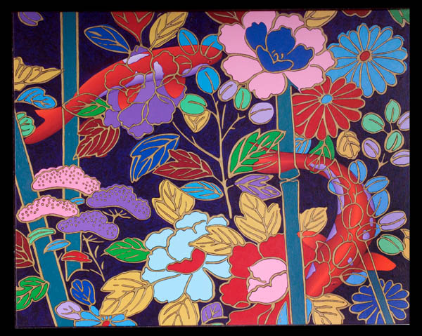 |
| Variety: Several different elements of design are used in this design, creating variety. |
 |
| Rhythm: The rolling hills, cool colors, and fog are traits that create rhythm in this image. It shows depth. |
 |
| Contrast: The different, contrasting, colors used in this image are meant to make the main image stand out from the background. How do you add a layer mask to a particular layer? After selecting the wanted layer, at the bottom of the layers palette, there is a small button that will create a mask for the layer when clicked on. What two colors are used to create the mask? Black and white Describe the process of using a layer mask? First, make sure that the mask is selected, not the actual picture. Then, make sure that the foreground color is black and the background color is white. Select the paint brush tool. After checking to make sure that the mode is normal and the opacity, flow, and hardness is 100%, begin painting around your image. When finished, link multiple layers together if you want them to move together! |
Monday, November 7, 2011
Stephen Kroninger
What kind of art/design does he produce?
He cuts up photographic images, often from pages of magazines, to create his collages.
In what publications/media studios has his work been featured?His work has been featured in Time Magazine, the Museum of Modern Art, Time, Newsweek, The New Yorker, and The New York Times.
Post 2 samples of his art. Answer the following questions for each piece...

Was this piece published? Where?
The New York Times
What principles of design were utilized within the piece? How?
Balance is used because there are dark objects, as well as light objects, so they weigh each other out. Emphasis is used because my eyes are drawn to the person on the bike, not the background. Unity because the design is all one. Variety because there are different elements of design used.
What elements of design were utilized?
Line, color, space, and shape.

Was this piece published? Where?
The New Yorker
What principles of design were utilized within the piece? How?
Proportion and scale are used because certain things stand out because of their size.
What elements of design were utilized?
The New Yorker
What principles of design were utilized within the piece? How?
Proportion and scale are used because certain things stand out because of their size.
What elements of design were utilized?
Space and shape
Review Week 12
How can you, as the designer, use principles of design to help compose a page?
Principles can affect the message of a design, so as a designer, enhancing the meaning or message of a design can be achieved by using the principles of design.
What are the principles of design (define each in your own words)?
Repetition is the use of an elements multiple times in a design. Proportion or scale is the corresponding size to the original element in a design. Balance is the variation of heavy and light elements in a design. Emphasis is calling the viewer to one area of a design. Unity is the "wholeness" of a design. Variety is the diversity of elements in a design. Rhythm is and organized movement in a design. Contrast is the difference between related elements.
Wednesday, November 2, 2011
Podcast #3 Principles of Design
Define principles of design?
Concepts used to arrange the structural elements of a composition
Concepts used to arrange the structural elements of a composition
What do the principles of design affect?
The expressive content (the message)
What is the principle of repetition?
Repetition is repeating some aspect or element of the design throughout the entire document.
Describe ways that the principle of repetition helps the composition/audience?
Acts as a visual piece that ties your piece together. It controls the readers eye and helps keep their attention on the piece. It works with patterns to make a composition seem active. Repeating design element helps the viewer navigate through the piece. It also helps unify and strengthen tying together separate parts.
What are ways that you can incorporate repetition into your designs?
Bold font, thick line, certain bullet, color, design element, particular format, and spatial relationship. It can be anything that the reader will visually recognize.
What should you avoid when working with repetition?
Repeating so much that it becomes annoying and overwhelming.
What is the principle of proportion/scale?
The relative size and scale of the various elements in a design.
What is the most universal standard of measure when judging size?
The human body
How can the principle of proportion/scale be used as an attention getter?
Unusual or unexpected scale
What is the principle of balance?
Distribution of heavy and light elements on the page
Which kinds of elements/shapes visually weigh heavier/greater?
Irregular shapes
What is another name for symmetrical balance?
Formal balance
Define symmetrical balance?
Occurs when the weight of a composition is evenly distributed around a central vertical or horizontal axis.
What is another name for asymmetrical balance?
Informal balance
Define asymmetrical balance?
Occurs when the weight of a composition is not evenly distributed around the axis.
What is the principle of emphasis?
Stressing of a particular area of focus rather than the maze of details of equal importance.
What happens to a design that has no focus?
Nothing stands out
What is a focal point and how is it created?
A focal point is an area where the eye tends to go first. It is created by making one element dominant with all other areas contributing but subordinate.
How many components of a composition can be a focal point?
One
What ways can emphasis be created in a design?
Contrasting the primary element with 3 subordinate elements. Sudden change in direction, size, shape, texture, color, tone, and line can create emphasis.
What is the principle of unity?
The "wholeness" of a composition
What three ways can unity be obtained?
1. Put objects close to one another. The viewers eye is forced to move from one to the nexy inevitable taking in the entire composition.
2. Making things similar. Using similar textures, colors, or shapes tends to visually connect the parts of a composition.
3. Direct vision by a line that travels around the design. This line can be a true line or it can be suggested.
What is the principle of variety?
Differences and diversity. It's what makes a work of art interesting.
What ways can a designer add variety to a design?
An artist can vary textures, color, and shapes, and alter their contrast, tone and intensity.
Why is it important to find the right balance between unity and variety?
Too much unity can be boring. However, too much variety can look chaotic. It's important to find the right balance to have a successful effective design!
What is figure?
A form, silhouette, or shape is naturally perceived as figure. It's the part of a composition that we pay attention to.
What is another name for figure?
Positive space
What is ground?
The surrounding area around a figure
What is another name for ground?
Negative space
When a composition is abstract (has no recognizable subject) what will the figure depend on? What does that mean?
The other elements in the composition
Why must a designer consider the composition as a whole?
Figure/ground relationship
What is the principle of rhythm?
Continuity, recurrence or organized movement in space and time.
How is rhythm achieved?
Through the orderly repetition of any element, line, shape, value (tone), texture.
What three ways can rhythm occur in a design?
1. Intervals between the elements, and often the elements themselves are similar in size or length.
2. With a more organic flowing sense of movement.
3. A sequence of shapes through progression of steps.
How does rhythm help a composition/design?
It can help deliver the message by controlling the viewer's eye movement.
What is the principle of contrast?
Occurs when two related elements are different.
How can contrast help a design?
Can draw the viewer's eye into the piece and help guide the viewer through it.
What is wrong with having too much or too little contrast in a design?
Too much similarity becomes monotonous and boring, but too much contrast can be confusing.
What is the key to working with contrast?
To make sure the differences are obvious.
What are some common ways of creating contrast?
Create differences in size, value, color, type, texture, shape, alignment, directions, and movement.
Subscribe to:
Comments (Atom)